
Source: IEA
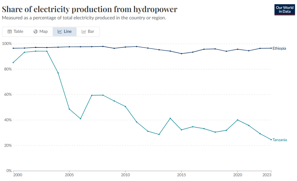
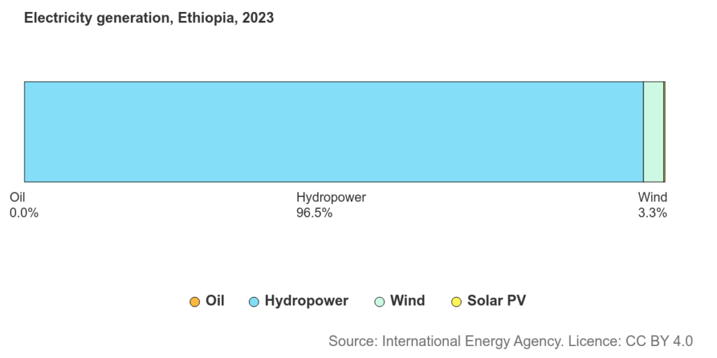
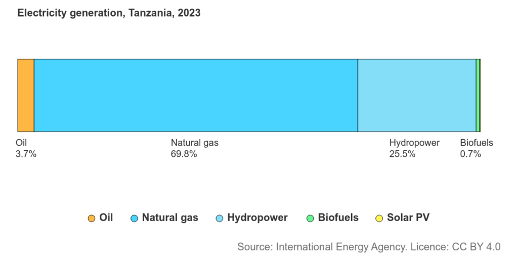
Instructions: Study the information in the graphs above to answer the questions.
Question 1: Identify the primary energy source Tanzania uses for electricity in 2023. What can you infer about how the country meets its energy needs?
Question 2: Describe the trends that you notice in hydropower use in Ethiopia and Tanzania from 2000 to 2023. Include at least two quantitative estimates from the graph to support your description.
Question 3: How do the trends in hydropower use reflect changes in Ethiopia’s and Tanzania’s energy systems over time?
Question 4: Evaluate the advantages and potential drawbacks of relying heavily on a single energy source for electricity. Support your answer with reasoning.
Question 5: What factors could shape whether it remains hydropower-focused or becomes more diverse?