
Instructions: Study the maps to answer the questions.
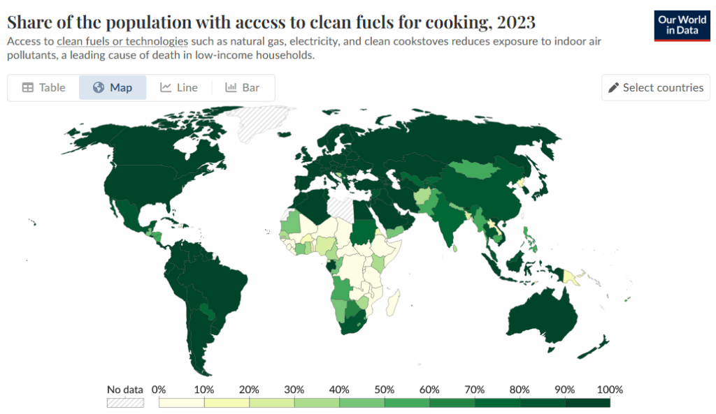
Question 1: Look at the first map above (Share of the population with access to clean fuels for cooking, 2023). If a country has very dark shading, does this mean that a high or low percentage of its population has access to modern fuels for cooking?
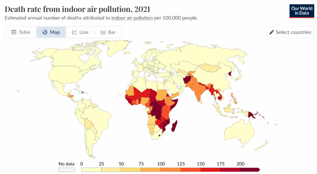
Question 2: Look at the second map above (Death rate from indoor air pollution, 2021). If a country has very dark shading, does this mean that the death rate from indoor air pollution is very high or very low? How can you tell?
Question 3: The first map shows access to modern fuels for cooking. The second shows death rates from indoor air pollution. How might these two topics be related? Use evidence from the maps to explain your reasoning.
Question 4: What kinds of fuels might people be using in places without non-biomass fuel access? How might using those fuels be affecting people’s health, as well as the environment?
Question 5: Create a question from one or both of the maps above and then answer it.
| My Question: |
| My Answer: |