
Source: Our World In Data
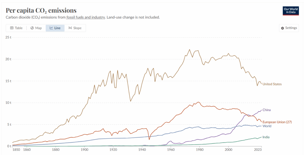
Data Table (Per Capita CO2 Emissions in tonnes per person)
| Country/Region | 1860 | 1960 | 2023 |
| China | 1.2 | 8.4 | |
| European Union | 0.6 | 5.9 | 5.6 |
| India | <0.1 | 0.3 | 2.1 |
| United States | 1.5 | 16.1 | 14.3 |
| World | 0.2 | 3.1 | 4.7 |
Instructions: Study the graph and data table above to answer the questions.
Question 1
Which country or region from the graph above had the highest per capita CO2 emissions in 2023, 1960, and 1860? In the last four decades, has its overall per capita CO2 emission increased or decreased in this country?
Question 2
Which countries or regions from the graph above have shown an increase in per capita CO2 emissions from 1960 to 2023? Do you think their per capita CO2 emissions will continue to increase in the next two decades? Why or why not?
Question 3
United States per capita CO2 emissions peaked at 22.3 tonnes per person in 1976. Describe at least two factors that you think influenced the United States’ overall decrease of CO2 emissions since then.
Question 4
Why do you think per person emissions calculations matter? Why not just look at overall CO2 emissions without considering population?
Question 5
Create a question from the data set above and answer it.
My question:
My answer: